How Do I Use a Curvo Dashboard?
Click on the "Reports" tab at the top of the page. You will see 3 options:
- Favorites: Dashboards you have marked as one of your Favorites
- Recent: Dashboards that you have recently accessed
- Dashboards: All of the Dashboards that have been shared with your profile
By default, you will land in the Favorites section unless you have not designated any Dashboard as a Favorite. In that case, you will land in the Dashboards section.
Select one of the Dashboards, example: "Curvo Exec Dashboard...":
Note: Select the star icon to add this dashboard to your favorites.

Next, filter any of the controls needed before you begin looking through the data.

Here you will see all of our standard Curvo Categories as well as top incumbent, price score, total spend and opportunity percentiles. Select any of the titles to filter that column as well as other graphs.

Then, select a specific category to review. For this example, "Arthroplasty" was selected.

Now you can scroll down through the various reports to deep dive into the information. In the example below you can see the relationship of volume and the weighted price score.

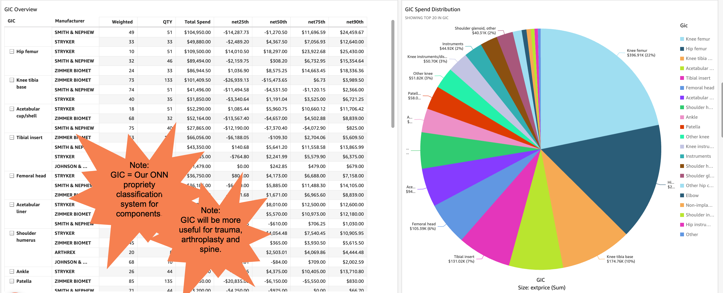
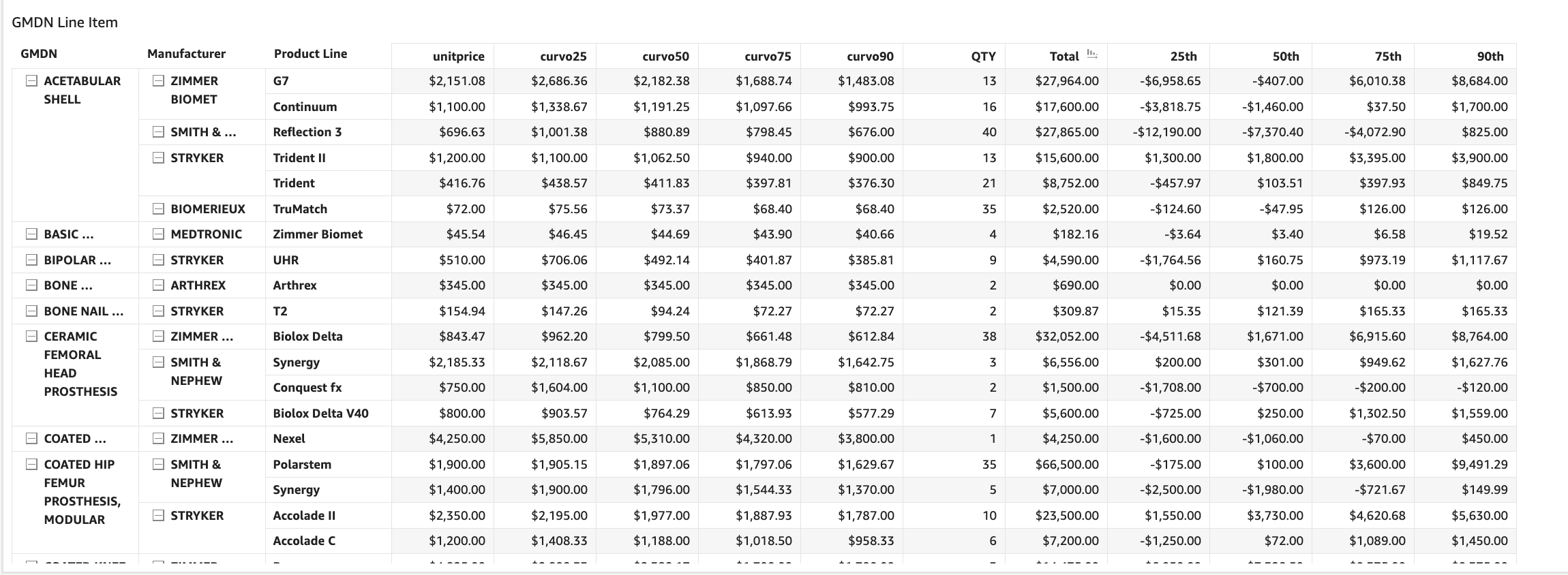
In the two screenshots below, the data is rolled up by different Curvo enrichments. One level of classification is GIC component level aggregation. The other level of classification is global medical device nomenclature GMDN is an FDA classification system which can be useful for categories outside of orthopedics.


This table displays the top ten products with benchmarking opportunities.

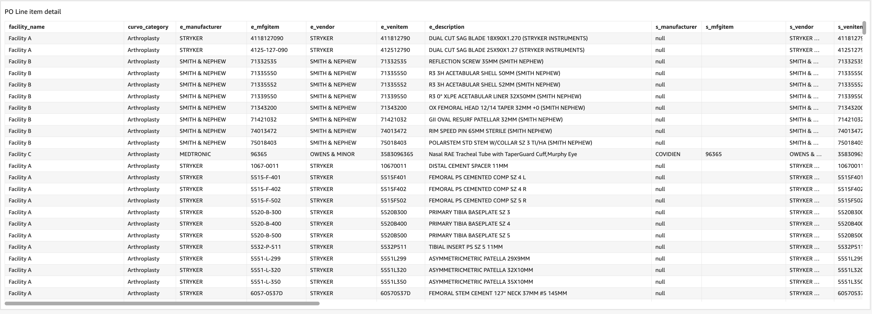
PO level detail can be found in the bottom table if it is helpful to audit the PO numbers.

Note: Any of these tables can be exported by clicking in the upper righthand corner of the table and selecting the 3 dots and then "Export to Excel."

